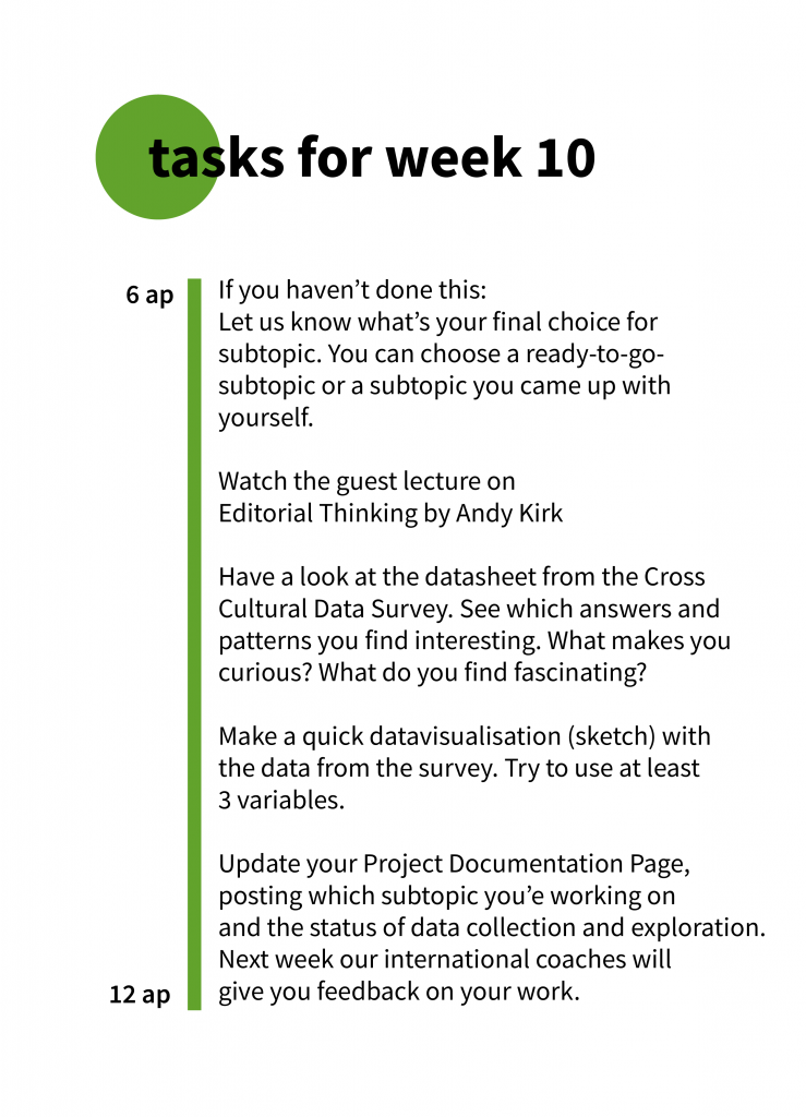
Goodbye!
Here is an overview of all the visualizations all of you made!
(We are still waiting for some, which we will post here as soon as we receive them!)
Afrah Usman, Plastic Waste
Afrah made a very interesting project on the use of single-use plastics and plastic recycling in Canada. Not only did she do excellent research on the topic but she also got her hands dirty by collecting personal data! She documented her single-use plastic consumption for one week and visualized it in her final piece.
Check out Afrah’s Notion page and presentation.
Alenka Gucek and Mariana Avila, Emotions felt during Covid pandemic
Alenka en Mariana dealt with one one of the hardest topics to visualise: how do people feel? How do you capture emotions in a data visualization? Not only did they tackle this design problem but they managed to work closely together as an international team despite the timezone difference between Mexico and Sweden. What a great collaboration!
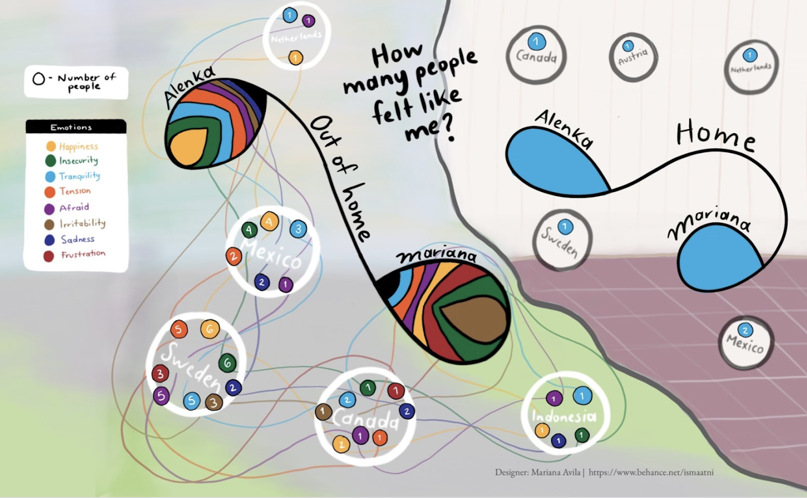
Check out all the cool experiments and visualizations they made in their presentation.
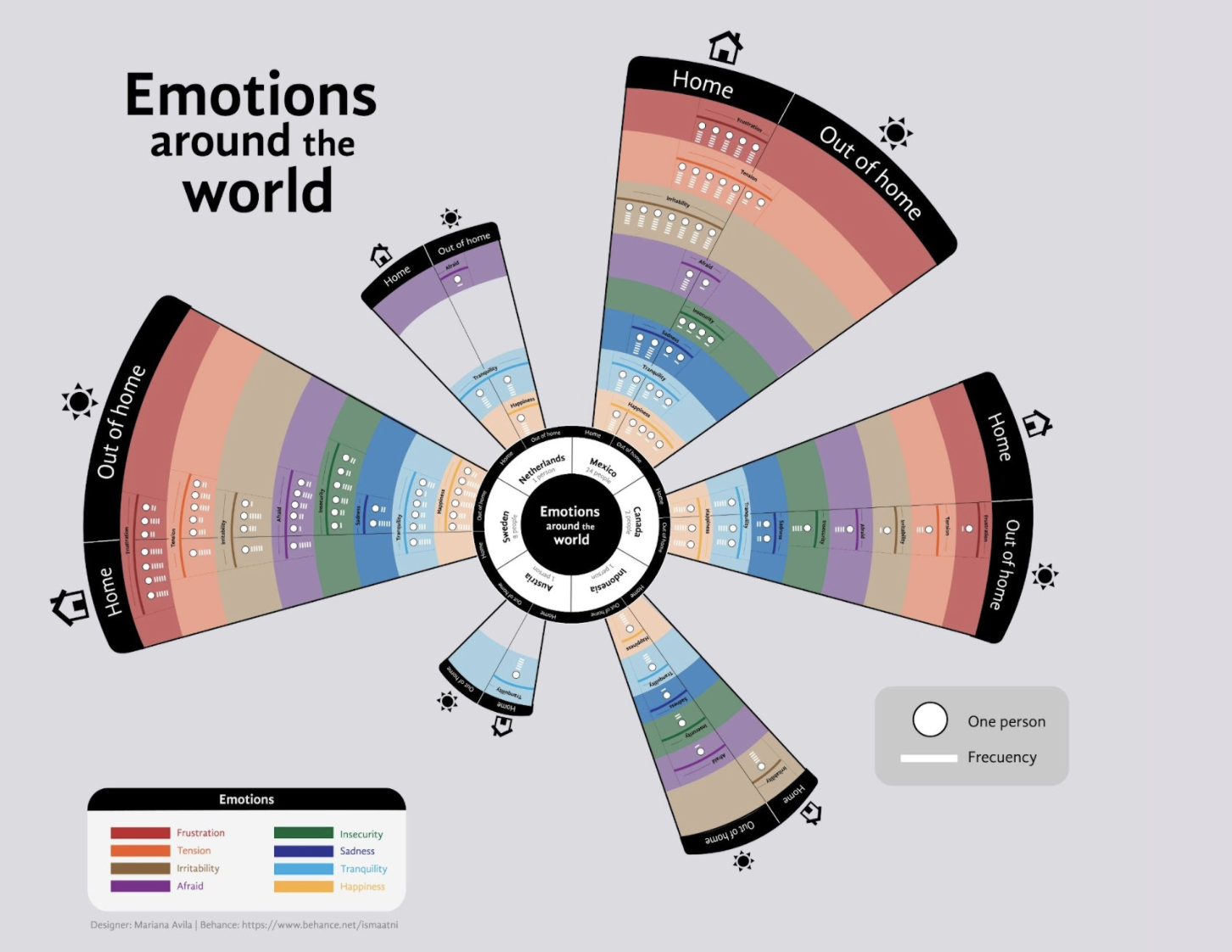
Florian Wendler, Clemens Sonntagbauer, stress and anxiety during Covid pandemic
Florian and Clemens handled a very interesting topic: feelings of stress and anxiety during the pandemic. The stats they made are super clear and show how stress related feelings increased heavily during the last year that was dominated by Covid. You take one look at their visuals and see in one glance what’s the situation.
You can find all the visualisations they made here.
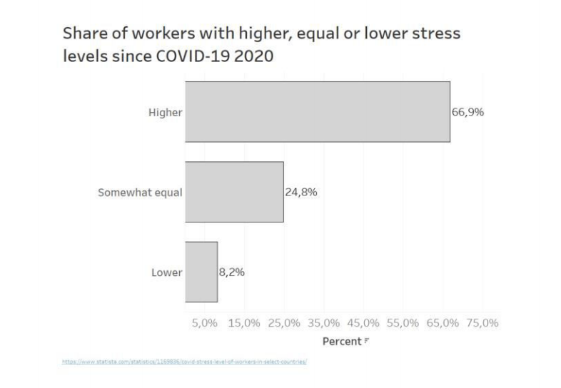
Emma Younan, Our Story
Emma addressed a very important topic: cyberbullying and its effects on the emotional health of teenagers. She made an interactive experience that sheds light on this topic from different perspectives and angles. We are impressed by her creativity in rendering the data, telling stories and making illustrations and animations that made the whole project into a true experience with a big impact.
Have a look at the extensive documentation of the design process. At the bottom of the section ‘Design Rationale’ you can find a screenrecording of the prototype, so you can experience the project yourself. The section CCDL/Datasets is written in English.
Robert Maksim and Sarah Marandi, Gender Pay Gap
Robert and Sarah didn’t stick to the first version of the data visualization that they made about the difference in salary and income between men and women In Europe. As true designers they tried out different chart types, color schemes and presentation modes. The results are interesting visualizations made in Tableau with a strong focus on the outliers.
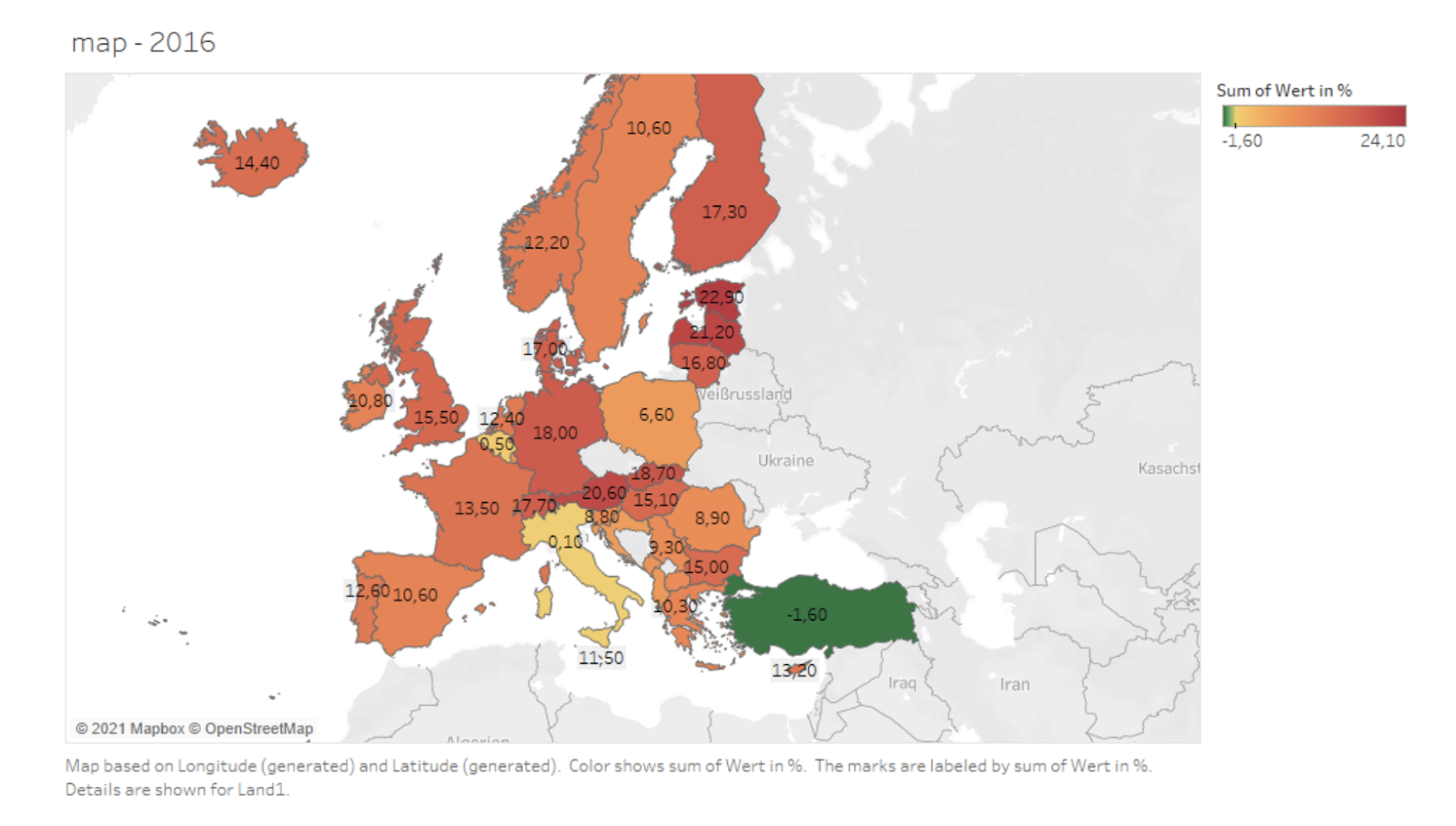
Explore the gender pay gap in European countries through these different visualisations.
Paul & Simon Hartlmaier, Antonia Thurner, Philipp Wöckinger, Homelessness
Here are some real Tableau masters! It’s so cool how these students made different graphs to shed light on the topic of homelessness in Austria and the USA. They managed not only to get across the topic, but also the difficulty of measuring and comparing homelessness in different places in the world. They took a deep dive into the data and included their findings about the quality of the data and collection methods in the visualization. 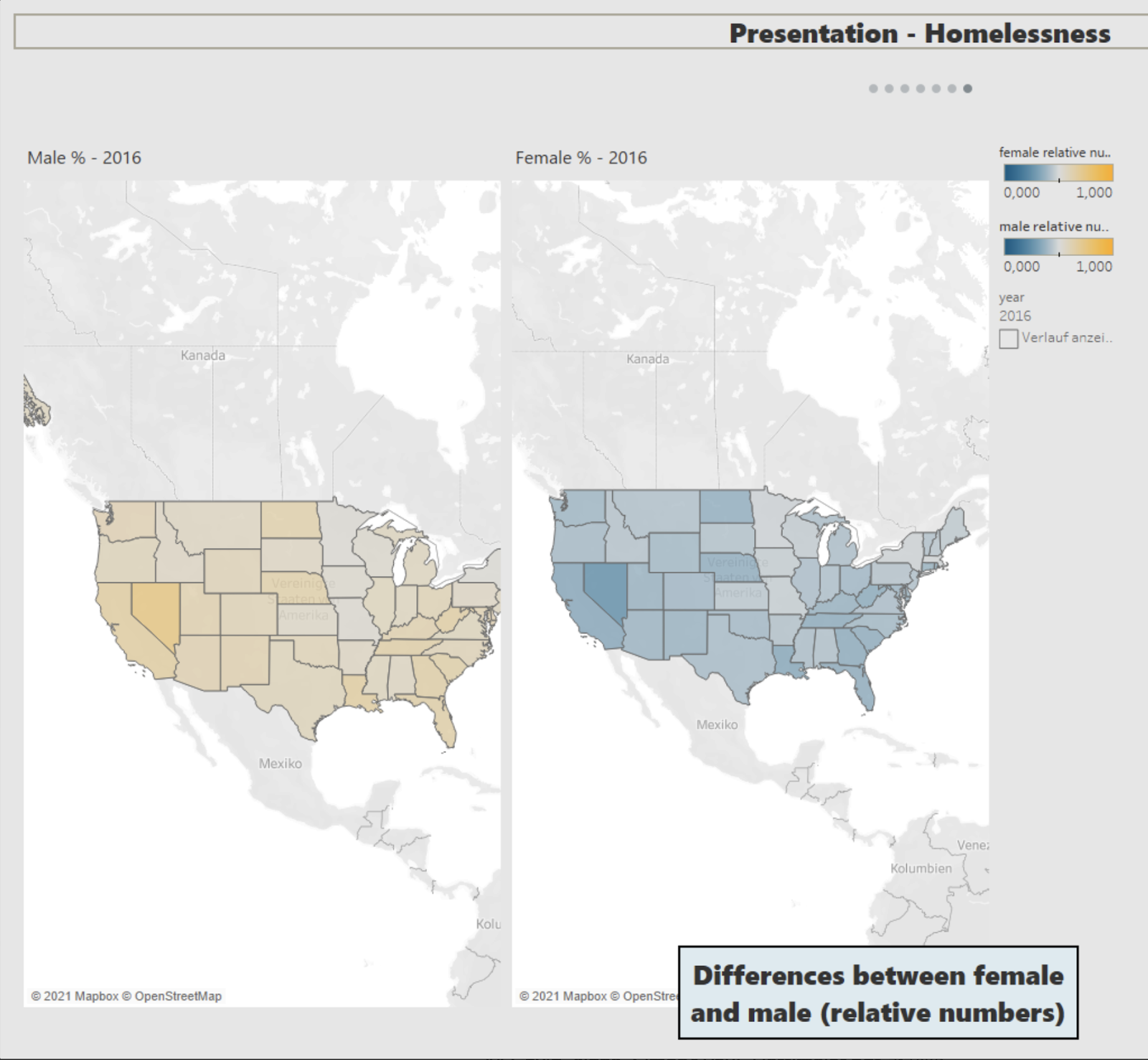
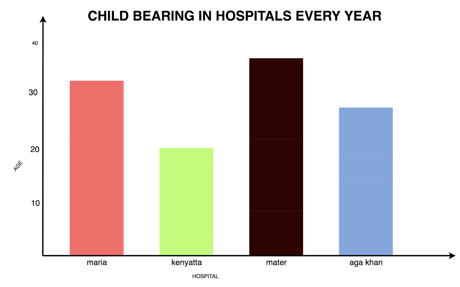
Duke Mairura, childbirth in hospitals in Nairobi
Duke collected experiences and data about giving birth in Nairobi. A topic that he never discussed before with women from his community. He said he was amazed by the stories he heard about giving birth, something that’s so common and universal in our world but feels unique to the mother.
Farah El-Gergawi, Childbirth
Farah did some great research into a topic that is quite sensitive in certain communities. We were very impressed by how invested she was in this issue. In Farah’s own words:
“After learning more about this topic of research, I think that every young female should know what their body will be going through and that they are well educated on that subject so that their judgement can’t be altered without their consent. Having this much more knowledge allows me to mentally and physically prepare myself. I have gained a new level of respect for all mothers out there. I would have never thought that this much pain and effort would be needed during birth.”
We are glad Farah addressed these issues that are often not spoken about! We also appreciated all the different ways she processed the data e.g. as in this “comment-cloud”:
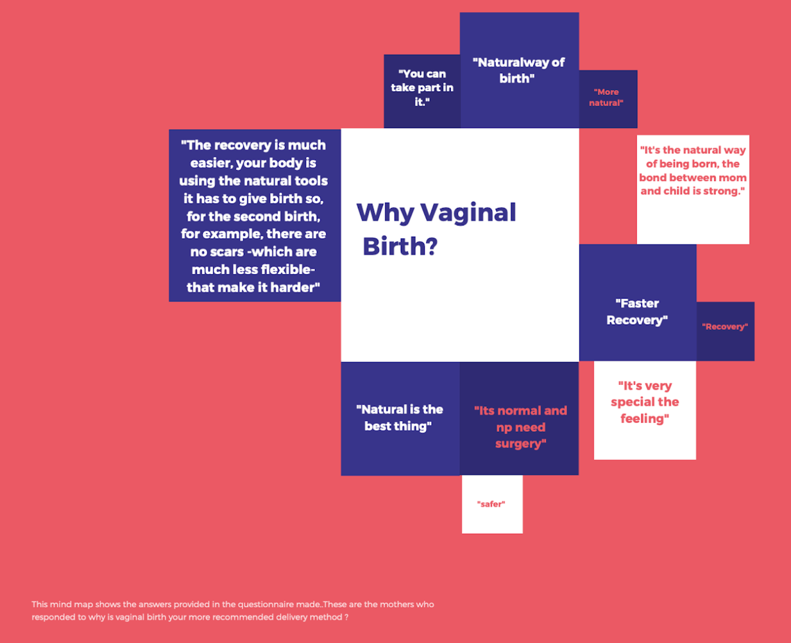
Have a look at the fantastic research she did and all the data visualizations she made on her documentation page.
Jo-Ann Bui, Substance Usage and Mental Health during COVID-19
This data visualization is one to explore! The topic itself is very interesting and Jo-Ann did her own research by setting up a thorough survey (which we find impressive!) and existing studies. The visualization needs some investment by the viewer, but taking the topic into consideration this works very well. We need more creative ways like these to represent data this way, where viewers need to focus and understand the numbers better, and create ways to understand the behaviors behind the numbers.
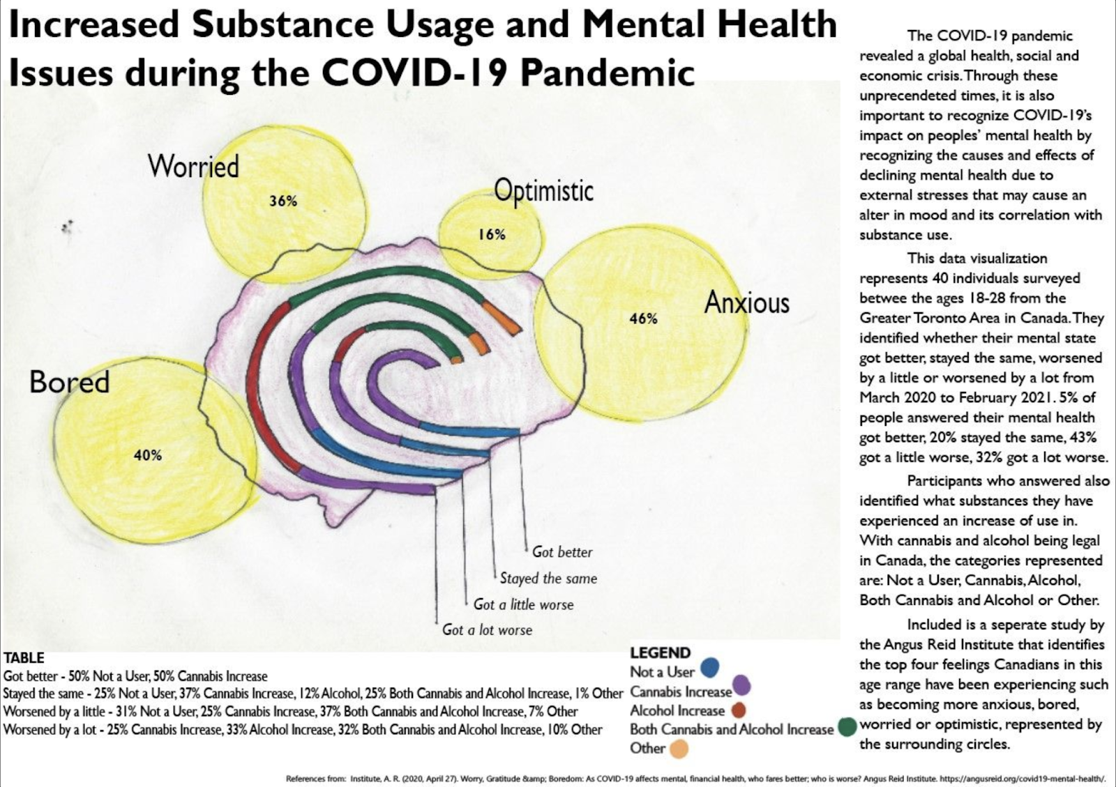
Find out more about the dat en the design proces on the documentation page.
Lisa-Maria Germ, Moritz Schnölzer, Mike Wachter , Health-tracking with Smart Watches
We really liked the way you used Tableau and discover NO correlation between the use of devices and a more active/healthier life 😅 We would have loved to see how you would take this to a next level, if you had more (recent) data. All in all this research made us really curious.
https://lisa-maria-germ.gitbook.io/health-tracking-with-smartwatches-fitnesswatches/visualisation
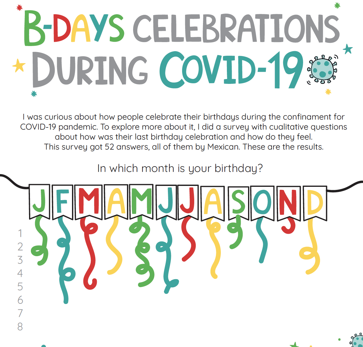
Aline Isidro, Celebrating Birthdays during Covid-19
Aline made a festive visualization about a cultural topic that is interesting for everyone: celebrating your birthday. She did an extensive survey about the celebration and experience of birthdays during Covid in Mexico. The visual design is very well executed: great lay-out, use of colors and typography. It makes the piece a fun whole.
Check out all the visuals
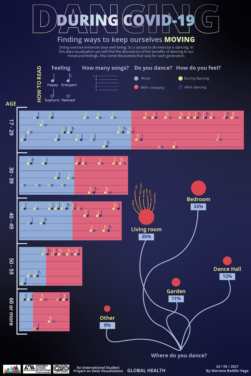
Mariana Badillo, Dancing during Covid-19
Mariana’s datavisualization is the only one that made us want to dance! Maybe it’s the lack of dancing we suffered during COVID-19 or is it that the way she designed this is so playful? We clearly recognize Mariana’s love for alternative approaches in the way she looked at Giorgia Lupi’s work. Great job and keep on dancing! 🕺🏿
Documentation page is found here.
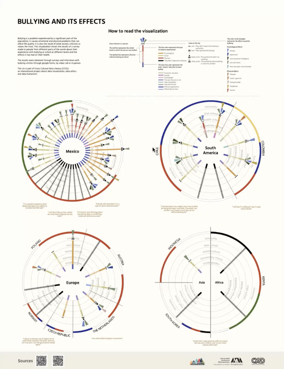
Tania Cabrera, Bullying and its Effects
We loved this well worked-out sophisticated datavis! Not one for easy consuming, it invites the viewer to dive into the subject and learn about the topic of bullying and its effects. A very specific way of coding and decoding inspired by Giorgia Lupi and Stefani Posavec, and therefore this exploratory visualization is the more powerful. The legend is very clear and because it is on top of the page, it is a way into reading the data. This project needs more data, because we want more! Well done Tania! 👏🏼
Oscar Hernandez, La Línea / The Journey
Oscar did not only make an impressive data visualization, he made a piece of art! His visualisation is highly explorative and shows the emotional LGBTTTIQ+ community in México COVID-19 pandemic.
Oscar wanted to handle the data of each person with the care and respect every human being deserves. His way of working pays off in the end result: a carefully crafted and beautiful visualization that reflects the lives and feeling of real people.
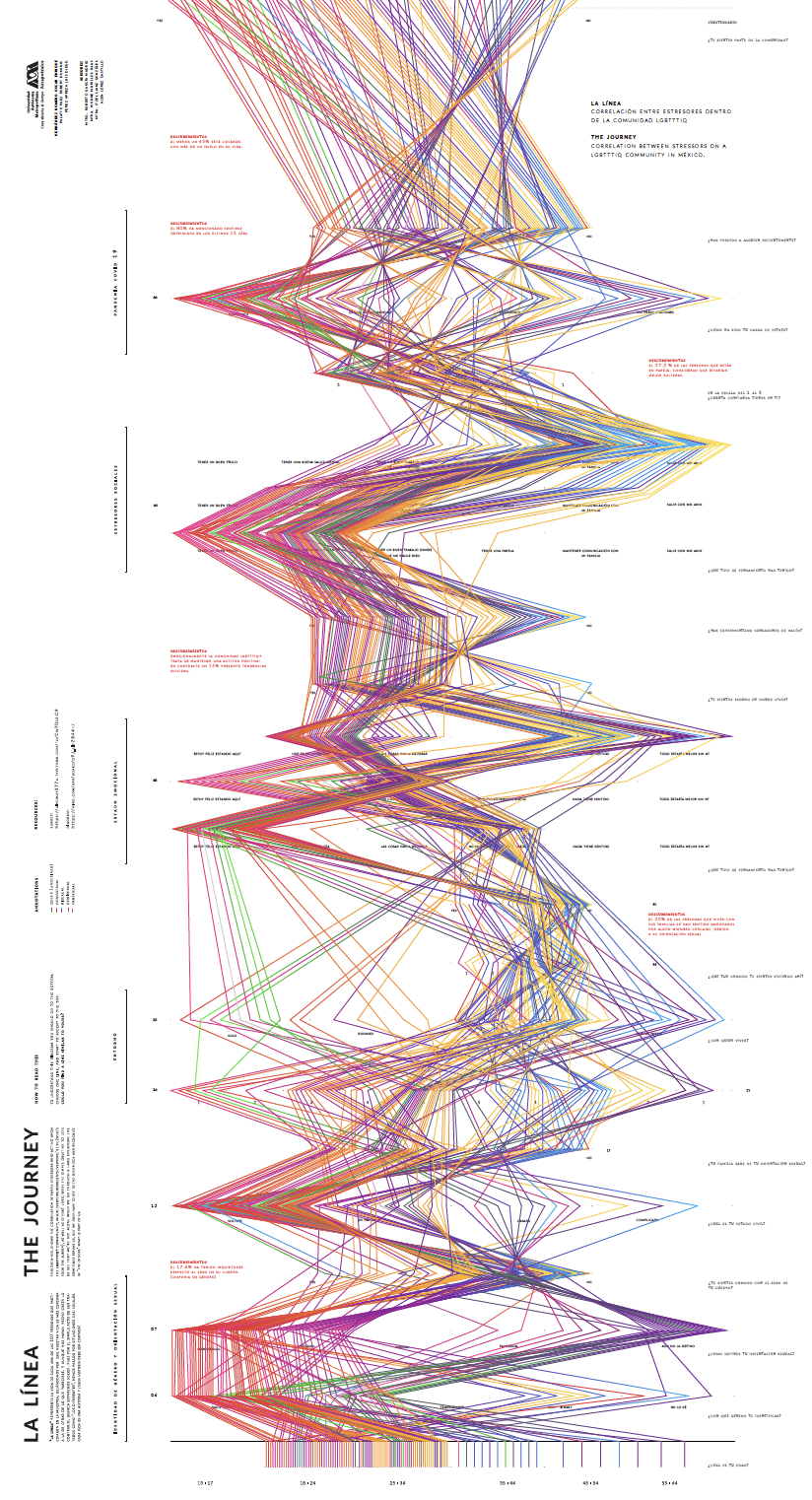
Have a look at the high res version of the visualisation. Also you can look at the diagram Oscar made for the survey, which is the basis for the visualisation.
Eyob Westerik, Catch your Crime Profile
Eyob made an application that’s actually working and you can test yourself! The application is a predictive policing system, like the police in the Netherlands uses to predict the likeliness that someone committed a crime.
Scan your face and see how your facial features are represented within the dutch crime data. Your crime profile will be based on machine learning algorithms and historical crime data. With his project Eyob wants to raise awareness about biases in predictive policing systems.
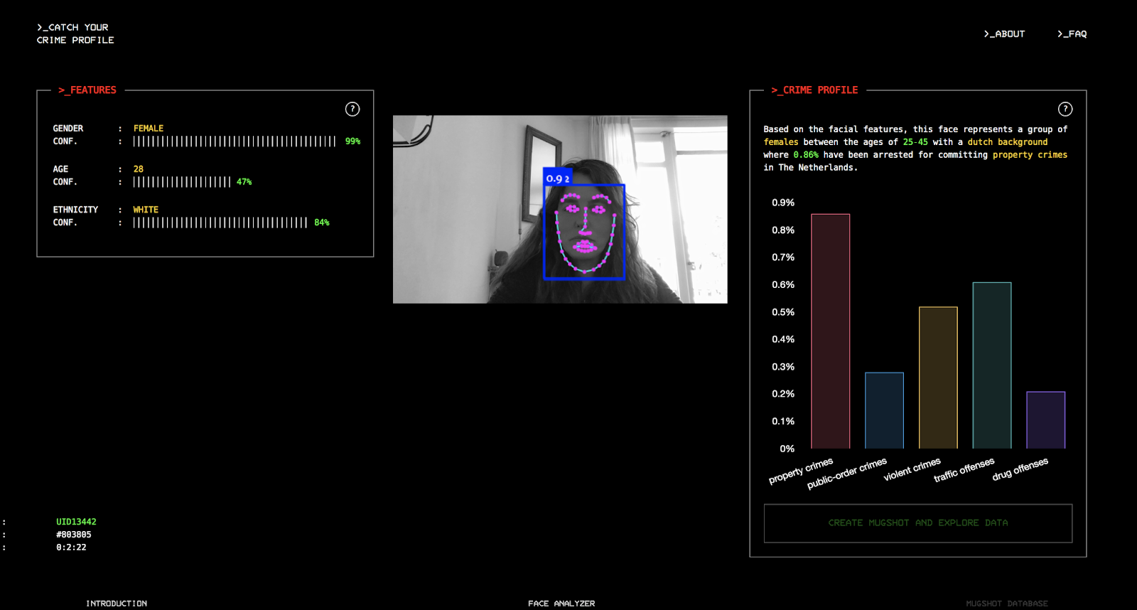
Try it for yourself here: https://catchyourcrimeprofile.netlify.app/
Ashley Rivera, childbirth during pandemic
Ashley made a beautiful overview about childbirth and pregnancy during the pandemic. We especially liked the quotes from the women, which make this infographic very personal, as does the silhouette of the pregnant woman. The fact that fewer babies were born in the world during the pandemic due to uncertainty is insightful, but also we tend to forget that the pandemic had a huge impact on women who were pregnant.
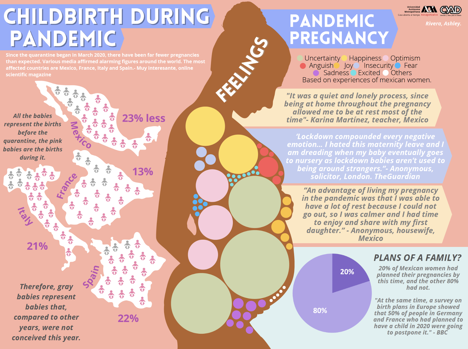
Documentation page is found here.
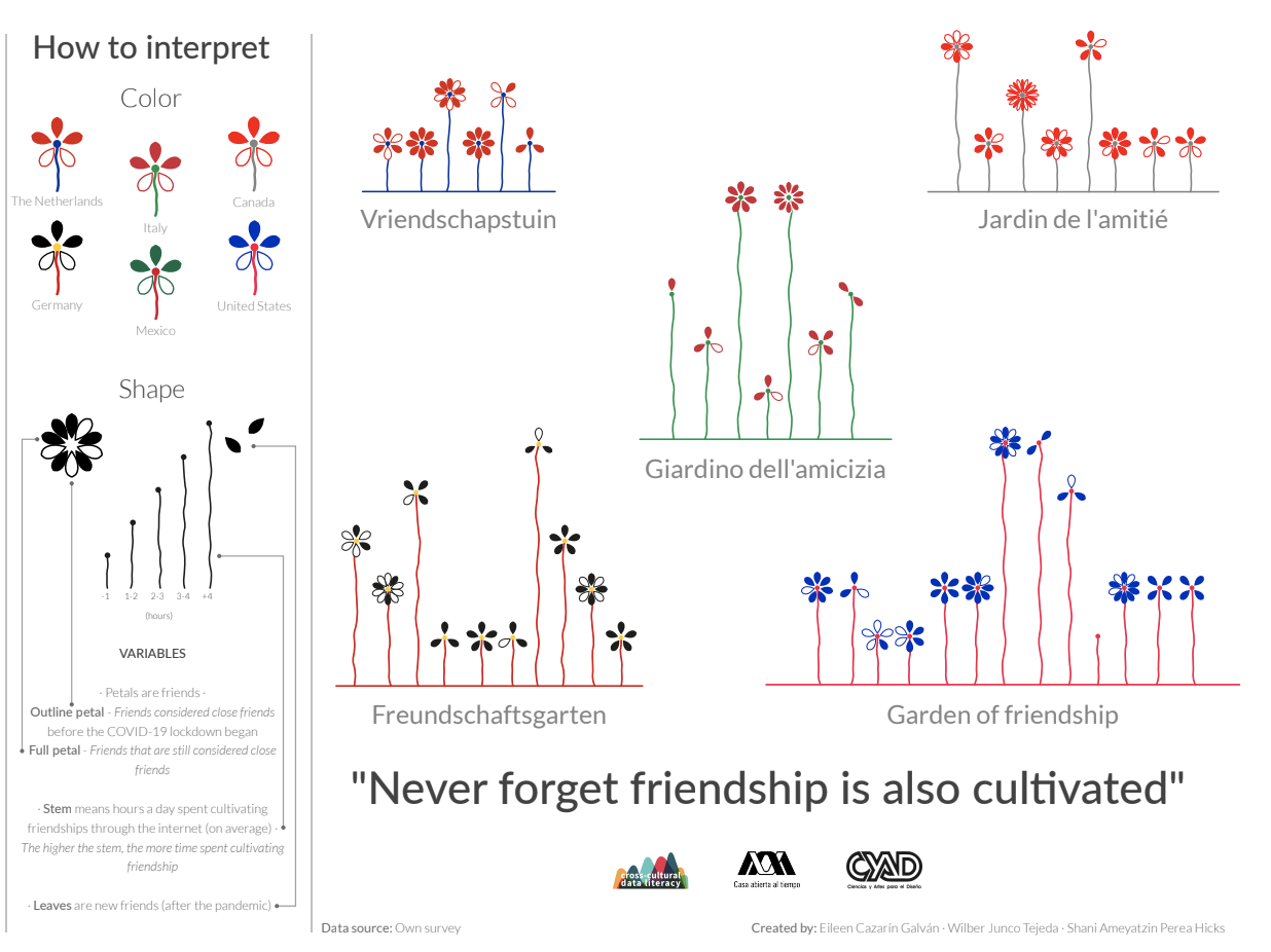
Shani Perea Hicks, Eileen en Wilber, Garden of Friendship
These three Mexican students made such a wonderful project about a topic everyone can relate to: friendship. It shows how people form different countries experienced and cultivated their friendships during the Covid Pandemic: did they lose friends? How much time did they spend on their friendships? Is there a difference in countries? The result is a very elegant piece that contains so much information and variables with just simple shapes. It proves how Eileen, Shani and Wilber master the art of visual encoding!
If you want to explore the friendship gardens of different countries and people, have a look at the final piece.
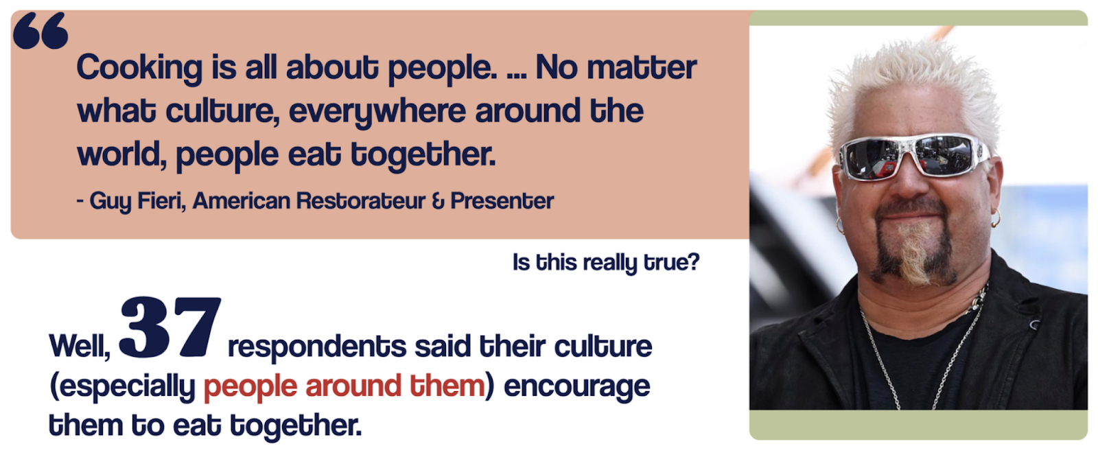
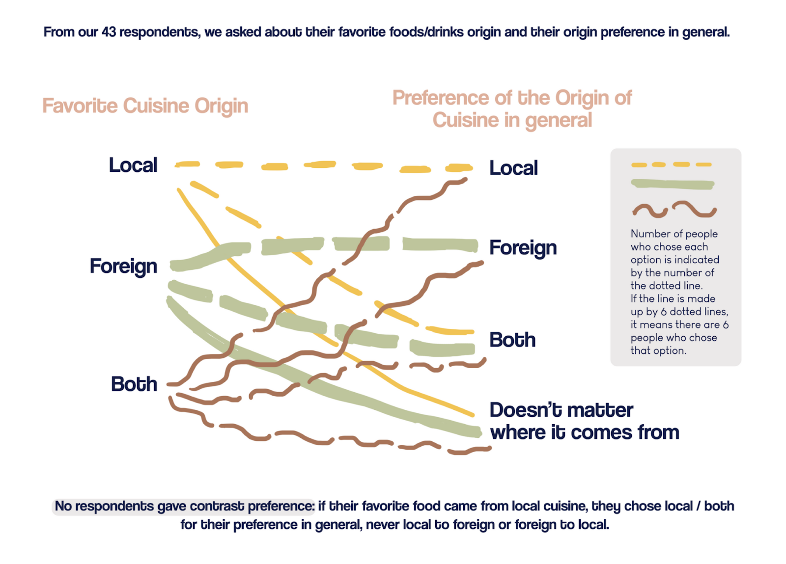
Fikha Adelia, Cuisine Across Culture
If there is one thing we like to know more about in a cross-cultural way, it’s FOOD! And Fikha took every single angle you can think of to do this great research and turn it into a very entertaining information-filled story. From slurping noodles in Japan to the fact that most people like to try out new things. We are eagerly waiting for the hand drawn portrait of Guy Fieri. 😉 This was a very jummy project!
These visuals are just a few of the many wonderful visuals Fikha made. Check out the documentation page for the full experience!
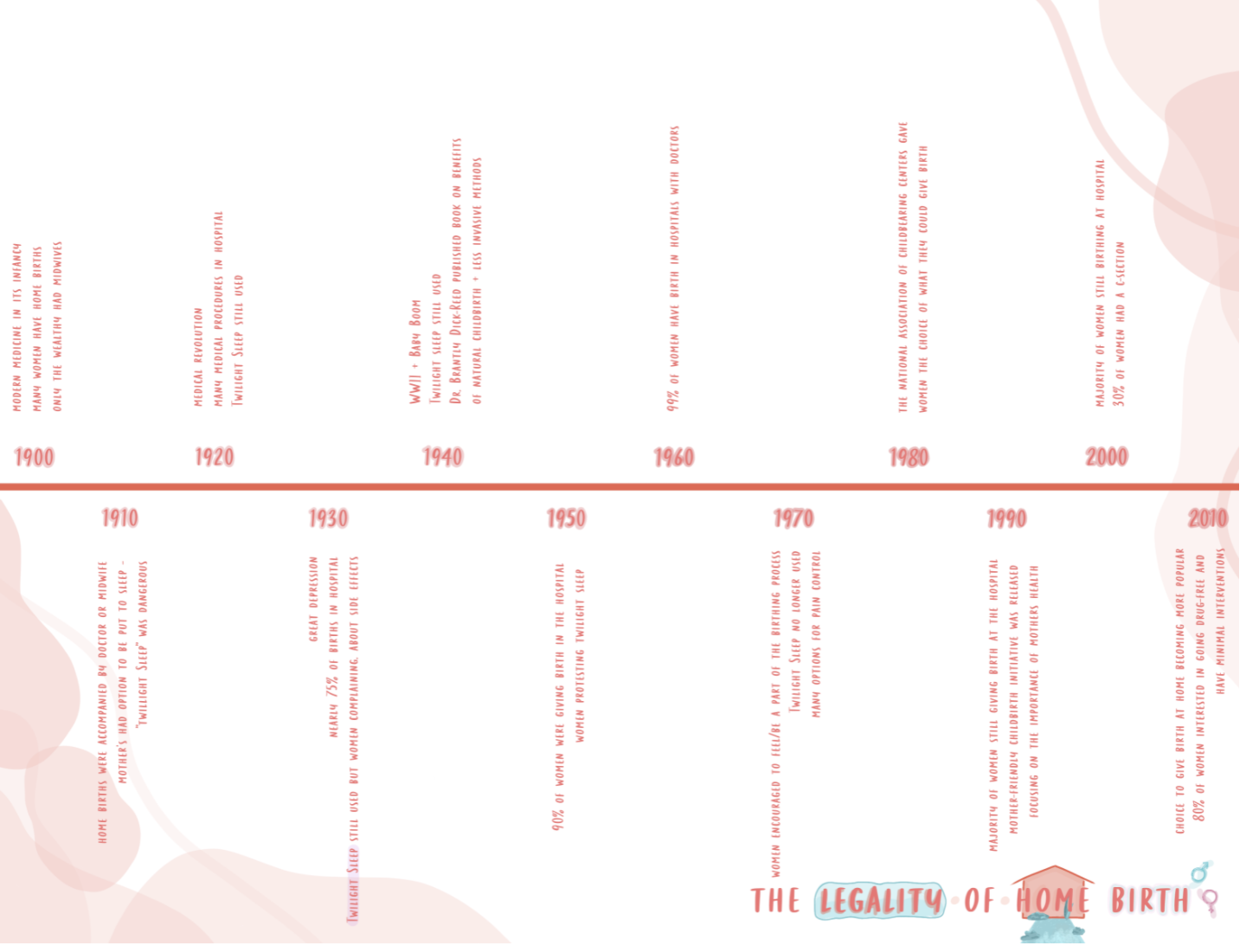
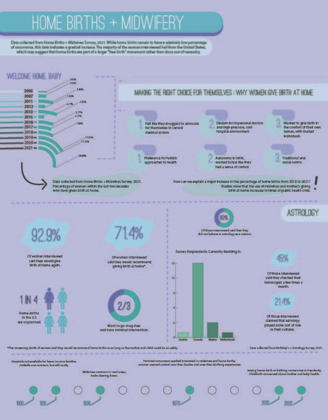
Elyse Kelly, Home Births and Midwifery
Another visualization about a topic that is underexposed. And what a good job Elyse did! In a very clear and accessible way this infographic tells us about home births and midwifery. Also, thorough research and a great survey makes this an impressive project! We learned a lot of new things here. 👶
Check out the documentation page.
Eva Janssen, Designedformen
Blown away by Eva Janssen’s beautifully illustrated website! Eva guides us through the information in a scrolly-telling way, and this works so well! Very interesting insights and playful interaction makes you want to dive deeper into the subject. A perfect way to tell the story of inequality between genders.
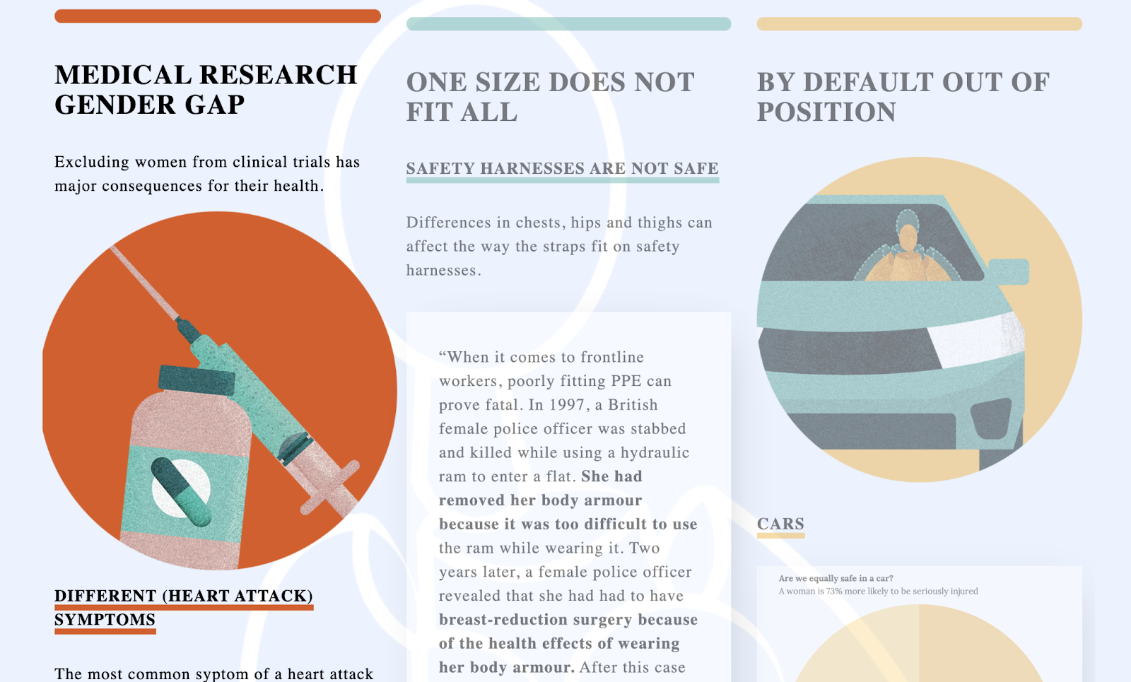
You can find the website here: https://designedformen.nl
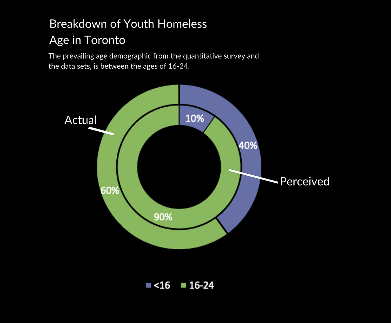
Cadence Tan, Youth Homeless – in Toronto, Canada
Cadence made a project with her heart about homeless youth in Toronto, Canada. Her project is more then a data visualisation, it’s a complete website with graphs, research findings and stories Cadance collected at local shelters in her neighbourhood. She talked in her presentation about ‘humbling data’: data that makes us realize how fortunate we are and that we should always strive for helping people who need support the most.
Check out the website:
https://cadancetan.wixsite.com/youth-homeless
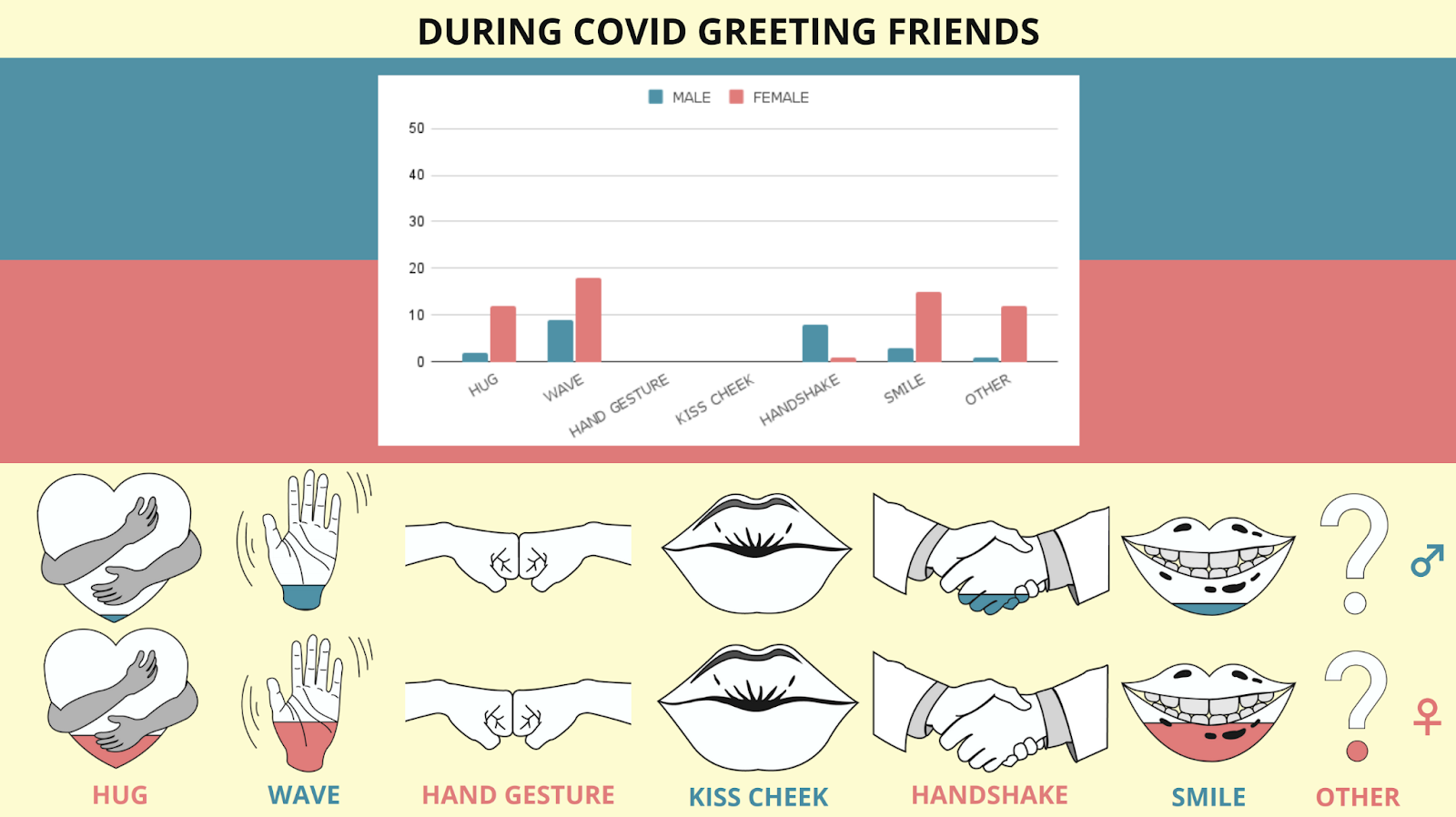
Taylor Ball, Andrea Auer, Sydney Garden – Greeting habits during COVID
In stylish colors this datavis shows us the way we changed our behavior during COVID-19. It made us wonder about the different cultures in the CCDL project, and the way people greet each other around the globe! We loved the way Taylor, Andrea and Sydney turned hard numbers into playful visuals about human contact. 👋🏼
Have a look at the full datavis.
Phillip Huynh, Florian Lachmayr, Jürgen Höglinger
This team dove into the different origins of refugee’s before and during the international refugee crisis of 2014/2015. They went for a data-centric approach an provided a useful overview of the rate of admittance for each country of origin. This work raises interesting question about why these patterns emerge and the personal stories of those involved.
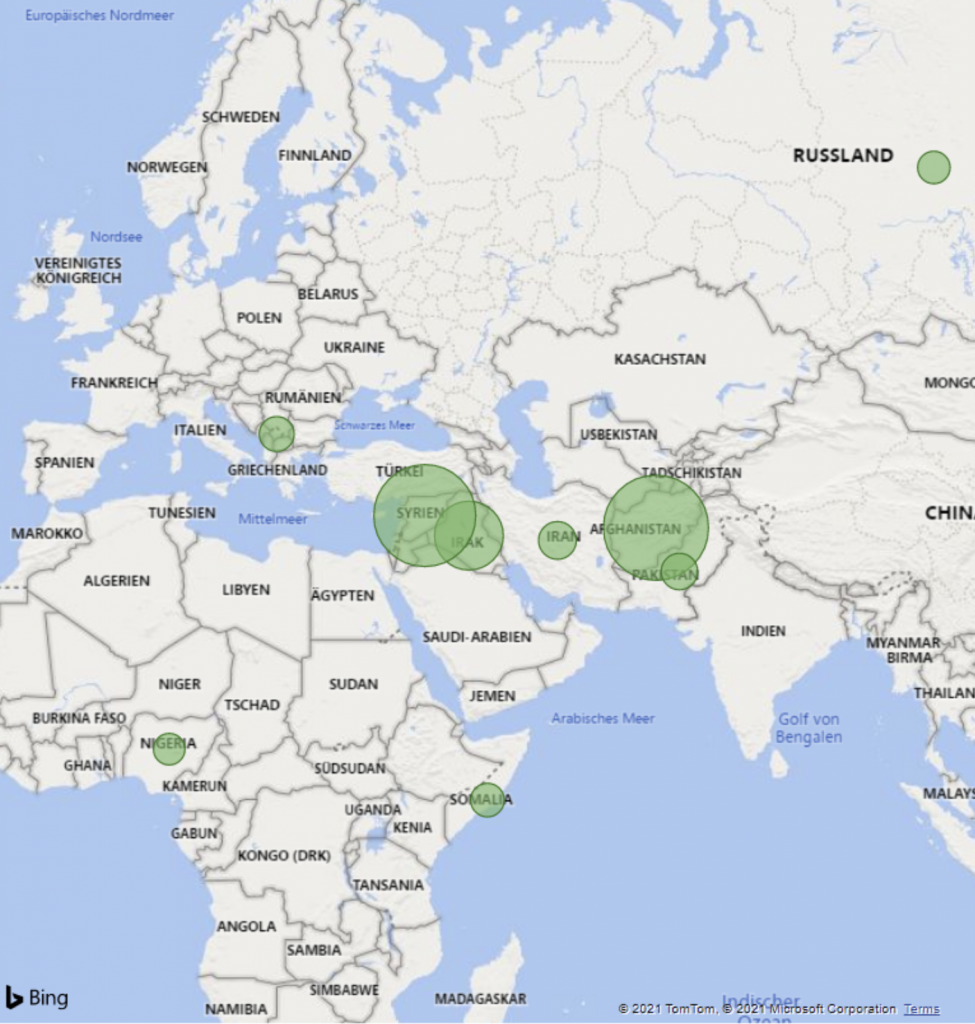
https://www.notion.so/Project-Documentation-a78b21064161463c9535f9ff45dad3fd
Felix von Rönne, Matteo Petrisic, Tobias Hollnsteiner
The mental health of german children and adolescents
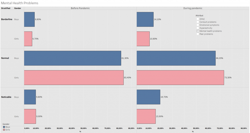
Project documentation page:
https://www.notion.so/Project-Documentation-Page-ad491f59559e4416b5353f44ec847956
Nick Meijer, Women and water
Nick made a project that teaches us a great deal about the heavy circumstances under which women and girls have to fetch water in Niger, by comparing our own water collection with that of Niger. Through a fantastic storytelling structure in his website, Nick confronts us with data, numbers and information about the clean water problem in Niger and the impact it has on the lives of women and girls.
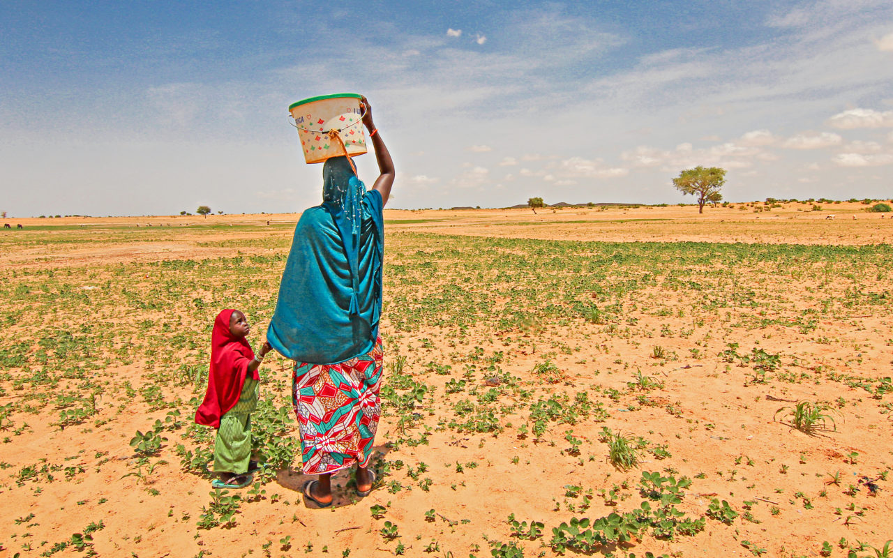
https://countnick.github.io/women-and-water/
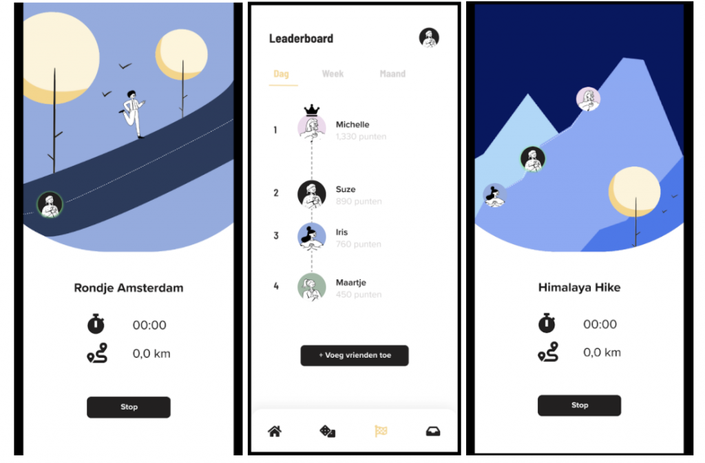
Iris Los, KOWA walking app
Who doesn’t like walking? Well if you don’t, you will after using the app Iris designed. The app captures your walking data, stimulates you with gamification and presents this in a very playful, beautifully illustrated way.
Try out the app yourself with this prototype or watch the screen recording (Dutch copy and type)
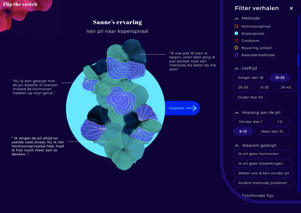
Fenna Foole, Flip the Switch
Fenna made a beautiful interactive project called ‘Flip the Switch’. It’s about the feelings and choices of women using hormonal contraception (birth control pill) that switched to another birth control method. The application lets users submit their own data on this subject and combines these to make a match with women with similar stories. It’s very cool to see how Fenna managed to design such a data driven project in a highly personal experience that honours the data and stories from women. Please check out the interactive prototype or the screen recording of the website. Maybe you can’t understand all the copy, as it’s in Dutch but the visuals speak out.
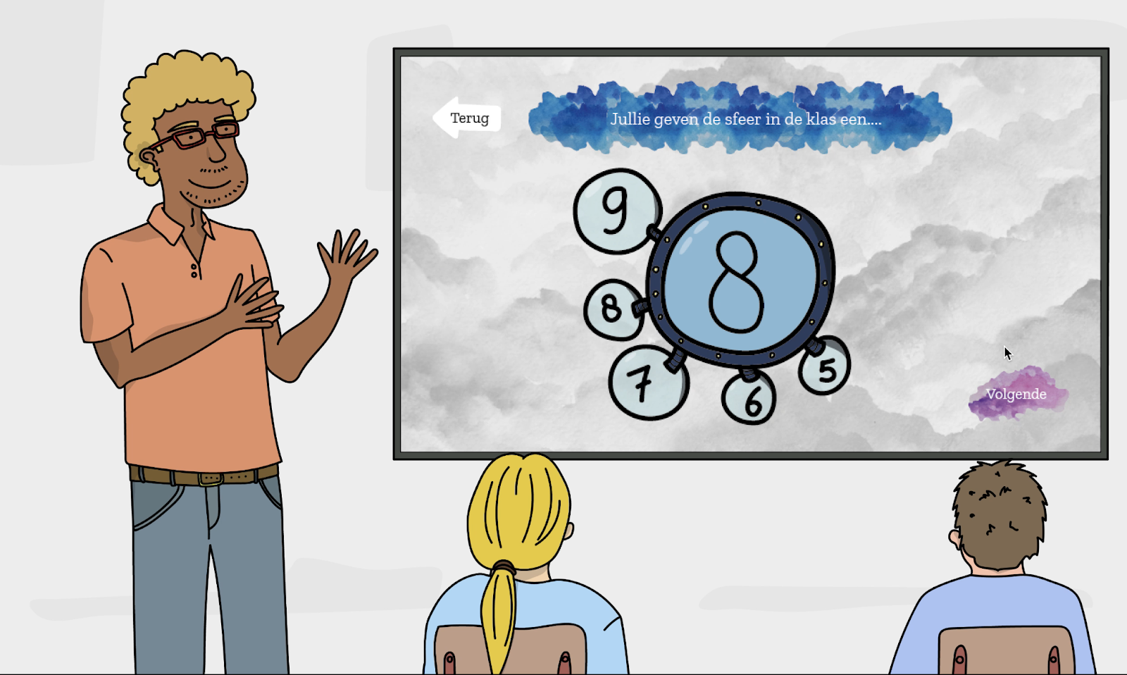
Maartje Veneman, Het Pestarchief
Maartje used all the data and stories she collected on bullying amongst children in the age group of 5-10 years old, to create the project Pest Archief (which is Dutch for ‘The Bullying Archive’). With this interactive program teachers can discuss the topic of bullying and talk about the social situation in the classroom. It’s a very unique and creative project. Have a look at the screen recording of the full interactive prototype.
Olivia Hobbie & Jenny Leitmann
Nina Krenn, Thomas Lorenz, Manuel Brankl, Fabian Laresser
An extensive exploration of E-bikes looking into safety, production, users and the difference with normal cyclists.
https://www.notion.so/Project-Documentation-14e0b169b8804554995f75cabc5e962d