Thank you for joining our international project about data visualisation and data-humanism!
In the spring of 2021 we run Cross Cultural Data Literacy, an international project about data visualisation, data-ethics and data-humanism. As a participant you can experience how data can be collected, read and visualised. This “data literacy” will make you aware of what data is, and hopefully encourage you to ask ethical questions about data.
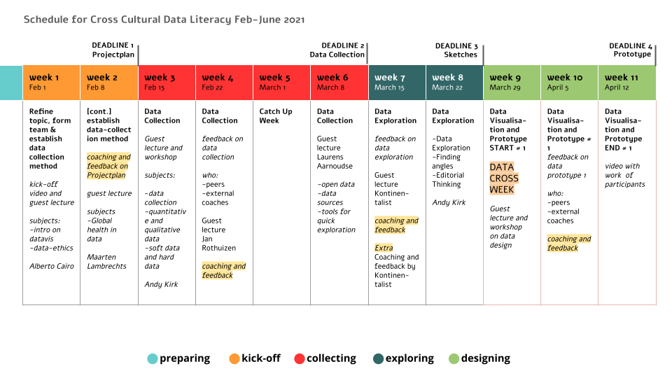
The project finished in June 2021. You can find an overview of student work on the For Participants page. If you scroll down, you’ll find the lay-out of the project with resources, assignments and guest lectures by information designers like Alberto Cairo, Andy Kirk and Maarten Lambrechts and lots of other fantastic speakers.
The project was a wonderful experience and we learned so much of it. We made friends and were touched by all the work and energy people put in it: foremost our students but also international coaches, teachers and lecturers that were involved. Big thanks to all who joined!
In February 2022 we will run a similar international data visualization project: Cross-cultural Data Visualization. It won’t be an exact copy: as we learned so much form CCDL, we wanted to iterate and apply the lessons learned. Feel free to contact us if your interested in joining!
Global Health was the main theme of this project. This theme can be interpreted very broadly. You can collect and visualize data about healthcare, but also about COVID-19, air quality, nutrition, mental health, sports and exercise, etcetera. This theme is derived one of the Sustainable Development Goals of the World Bank.
Students with a wide variety of cultural backgrounds from around the globe will work together and exchange data, using their cultural variety as a lens to learn from these differences.
During the course of the project you will create data visualisations and data stories from a human perspective. This means designing data visualisations representing the real lives of people and their behaviour.
Collaborating Partners
See who we are working with.
How does this work?
Find out how you can participate!
“We are ready to question the impersonality of a merely technical approach to data and to begin designing ways to connect numbers to what they really stand for: knowledge, behaviors, people.”
~ Giorgia Lupi
We believe data should be accessible and empowering for everybody. Data can be a powerful tool for people, enabling them to enrich their lives, broaden their view on society and learn from each other.
The quote from Giorgia Lupi you see above, was one of our main inspiration sources. You can read her whole manifesto here.
Join our project!
Drop us a line and we will contact you.