The project revolves around sharing and collaborating, creating and prototyping and learning and growing.
Students and teachers in the fields of data, design, journalism and technology will collect, share and visualise each others data and get insights of what data means, learn from each others interpretation and discover meaningful patterns.
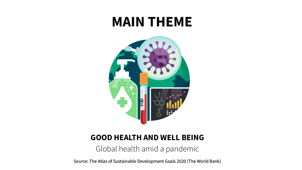
Global Health
To start with, we came up with a theme that all data visualisations and projects will be related to: Global Health. This theme can be interpreted very broadly. You can collect and visualize data about healthcare, but also about COVID-19, air quality, nutrition, mental health, sports and exercise, etcetera. This theme is derived one of the Sustainable Development Goals of the World Bank: https://datatopics.worldbank.org/sdgatlas/goal-3-good-health-and-well-being/
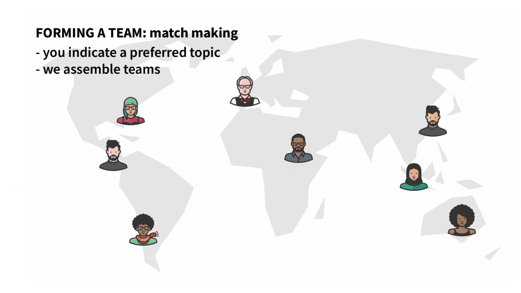
Matchmaking
At the start of the project we will organise an online brainstorm session in which we will agree on some interesting topics within the theme of Global Health. The outcome of this brainstorm will determine the topics we will work on.
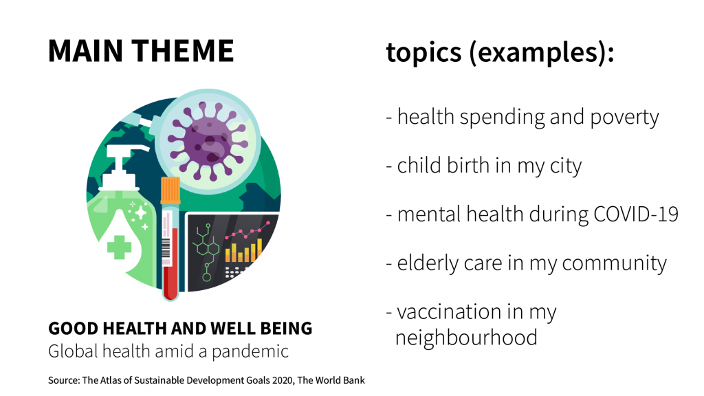
The topics above are just random examples for the sake of argument. You can of course choose these entirely at your own discretion. Now we will assemble teams from 5 to 10 students, to ensure there is enough interesting data to work with.
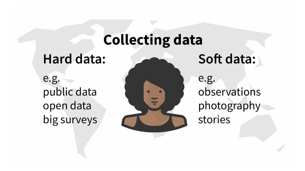
Hard and Soft Data
We like to urge that you not only collect numerical data by doing research, but that you also collect “soft” data from your own environment. This can also be numerical data (you count, for example, how often the word ‘corona’ is used during conversations with friends, or you count the number of people doing exercise in the local park) but also visual data, like video or photography, or even drawings.
Suppose you want to map out how elderly care is arranged in different cities in different countries. You will be looking for data on how many elderly people live at home, how many in retirement homes or nursing homes, how many elderly people use home care, etc. You may also want to show what elderly care looks like. You may talk to a substantial number of elderly people, take a short survey and take a picture of their main pastime (e.g. painting, reading, doing community work, doing puzzles, taking a stroll, to name a few). You now have a nice and rich dataset that paints a picture of life and care around the elderly in your community.
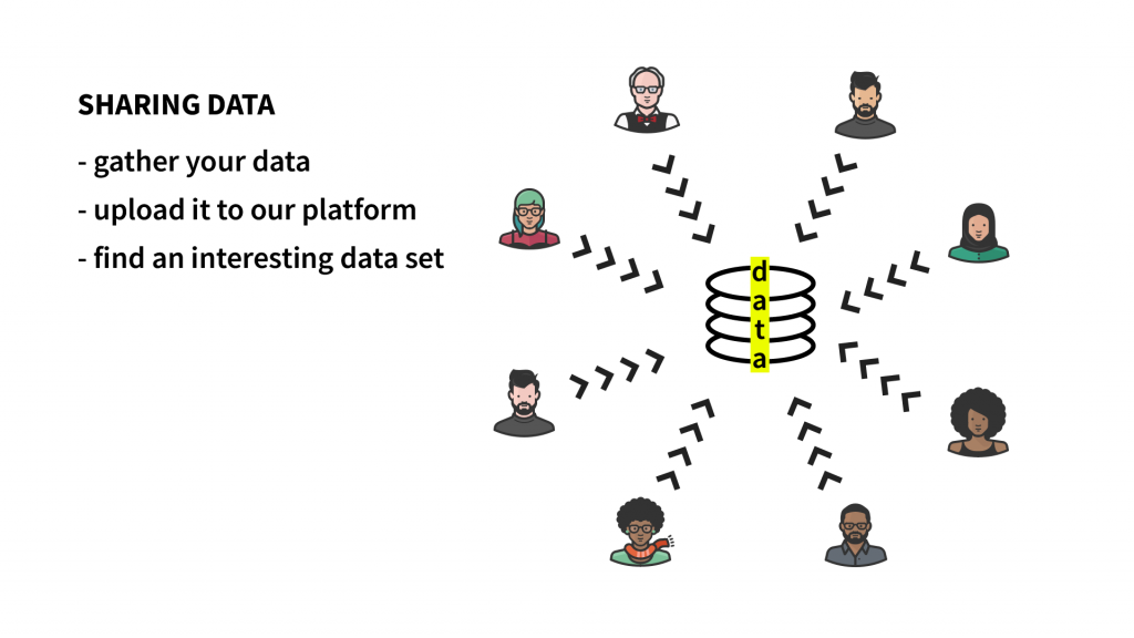
Now you upload the data to our server! 🙂
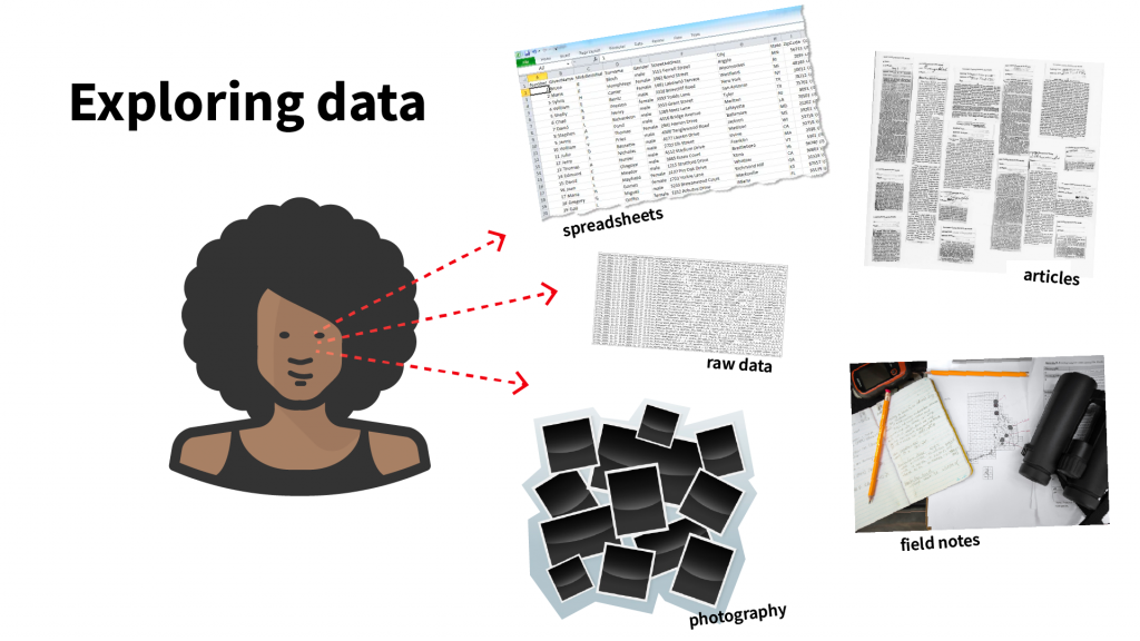
If your group has uploaded the data to the server, it is time to explore the data. What type of data has everybody gathered? Does the data make any sense to you? What is the story behind the data?
Students will choose individually what datasets from this group they are going to use to design the final data visualization(s).
Example Student Project
This is a great example of a student who has done a data visualization project on healthcare infrastructure in India: https://medium.com/nightingale/visualizing-indias-public-health-infrastructure-bbc91dfac1a4
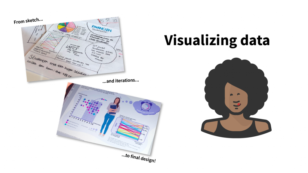
All students from your group will visualize their chosen set data. This way you can make comparisons and learn something about and from others.
Angle of approach and expertise
You can visualize the data from the above examples in various ways and make it accessible. For example, you can do it from a technical perspective: which techniques can you best use to visualize and make the data accessible? A bit like the work of information designer Nadieh Bremer. But you can also approach it more from a visual angle: Which shapes, colors, lines can you best use to tell your story with this data? A bit like the work of information designer Giorgia Lupi. You could also work in a team, with a combination of visual students and technical students.
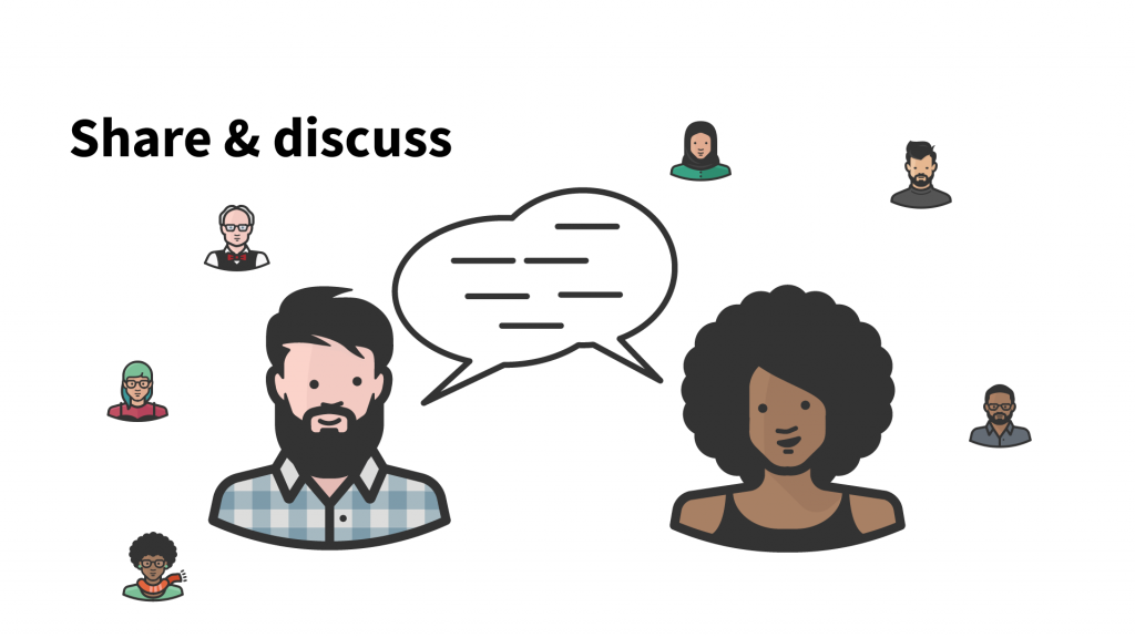
If you have finished your data visualization, it’s time to share it with the world! This is also the moment to look at the work of your peers.
Period and time investment
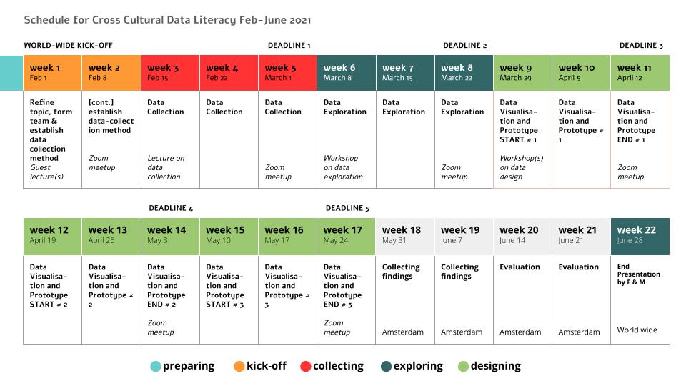
It is important to join the first couple of weeks of the project, in which we will organise the kick-off (with renowned guest lecturers), determine the topics and organise the teams. After this, you are free to do one design sprint, two, or three.
We offer:
In the period from february 2021 to june 2021 we offer students the possibility to generate, collect and exchange data on a certain theme (hard and soft data).
We offer guidelines and examples of how to collect hard and soft data, how to analyse the data en how to craft stories and visualisations from the data.
We offer a network and a platform where peer feedback is provided, reviews will be given and “on demand” video lectures will take place on a certain theme or way of working.
Everything will be collected on a website/platform.
We ask:
Basic knowledge of data visualisation of students.
Students collecting hard and soft data around a the theme Global Health.
Students must be willing to share their data on our safe and dedicated platform.
Students must be willing to cooperate with students from other countries.
Students are free in the way they visualise the data sets (interactive websites, animations, printed posters, etc.).